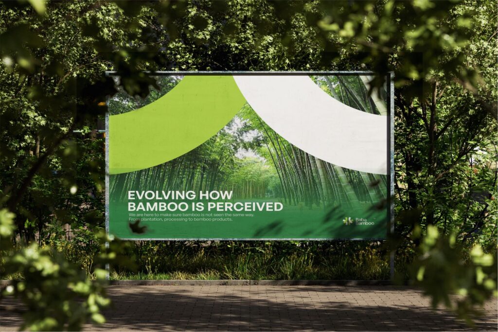
Baba Bamboo is not just a business but a movement towards a sustainable and eco-friendly future. Through this philosophy, Baba Bamboo is dedicated to transforming how bamboo is perceived and utilized across industries. We envision a future where Baba Bamboo will offer premium and eco-friendly bamboo products while fostering environmental stewardship and community empowerment.
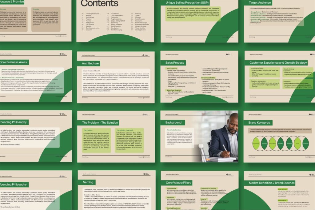
Baba Bamboo is a forward-thinking company dedicated to the promotion, cultivating and commercialization of bamboo and it’s value chain. It operates across multiple sectors, from sustainable construction materials to energy, leveraging the versatility of bamboo to drive economic growth and environmental sustainability
CORE BUSINESS AREAS.
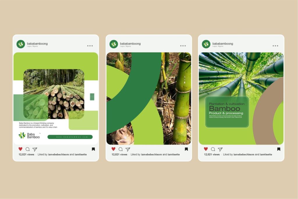
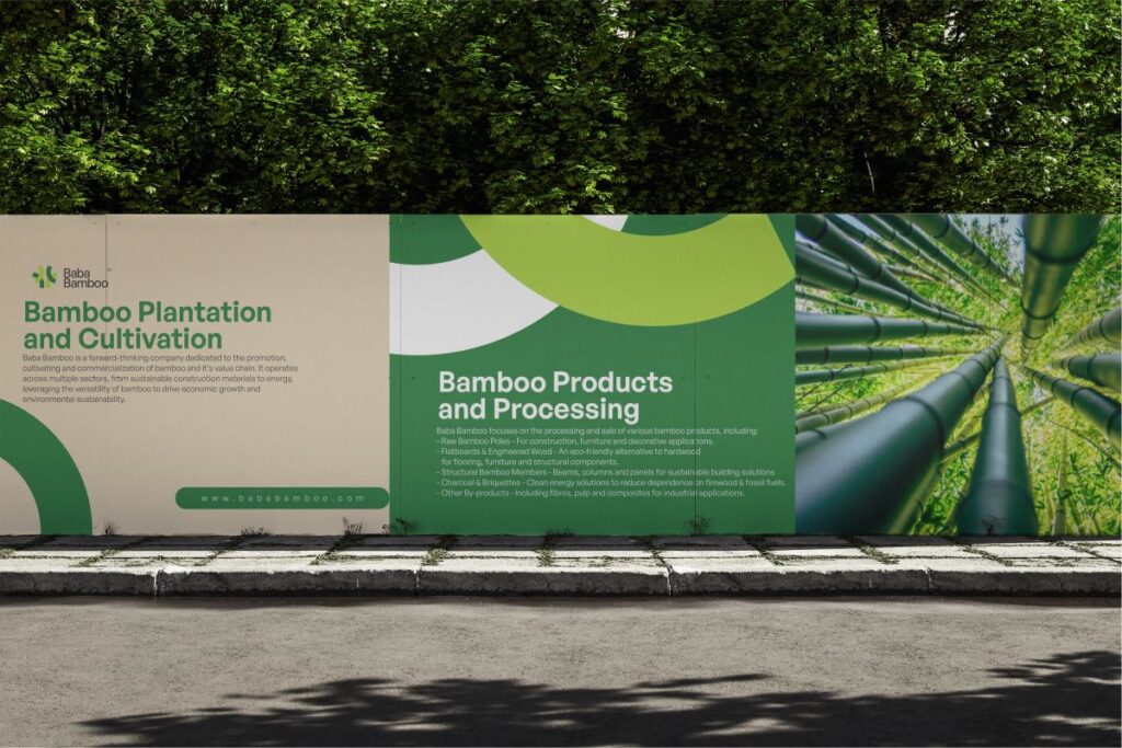
Bamboo Plantation & Cultivation:– Development of sustainable bamboo plantations for commercial and industrial use- Promotes afforestation and land restoration using bamboo, known for it’s rapid growth and carbon sequestration properties.
Bamboo Products & Processing: Baba Bamboo focuses on the processing and sale of various bamboo products, including:- Raw Bamboo Poles – For construction, furniture and decorative applications.- Flatboards & Engineered Wood – An eco-friendly alternative to hardwood for flooring, furniture and structural components.- Structural Bamboo Members – Beams, columns & panels for sustainable building solutions- Charcoal & Briquettes – Clean energy solutions to reduce dependence on firewood & fossil fuels.- Other By-products
OBJECTIVE
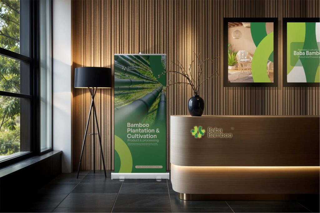
Distinctive Visual Identity:– To reflect sustainability, use earthy, natural tones (green, brown, beige)- Create a strong yet elegant typography that conveys durability and modernity.- Minimalist yet impactful design to align with premium sustainability brands.
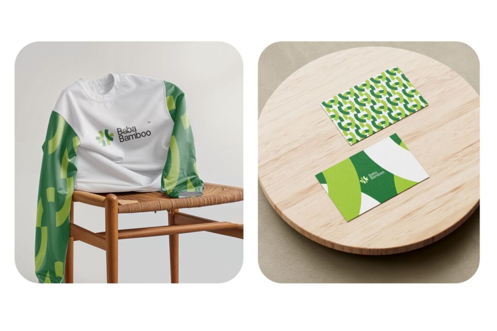
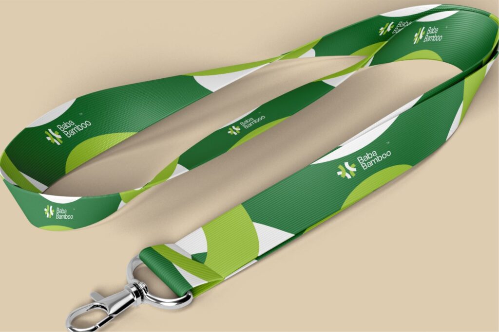
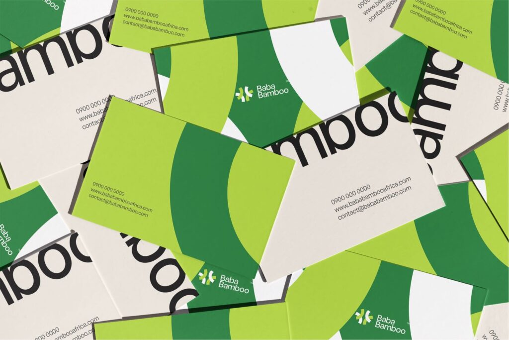
Consistent Across Media:- Design adaptable brand assets that maintain their impact whether displayed on digital platform, print materials or merchandise.
Brand Guideline:– Create a comprehensive brand guideline including brand strategy. This is to ensure the write usage of the logo and brand assets across all marketing touchpoints.
Advantage Over Competitors: – Position Baba Bamboo as a go-to brand for all bamboo products and processing ensuring the intersection of sustainability, innovation, and economic growth, offering premium, eco-friendly bamboo products while fostering environmental stewardship and community empowerment
Professionalism and Expertise:– Design strategies and elements should be integrated to not only appeal to its audience, but to convey professionalism, sustainability, and quality that defines Baba Bamboo’s approach to delivering premium, eco-friendly bamboo products.
Foster A Community:– Ensure a welcoming tone of voice to build an emotional connection with the target audience while conveying a clear brand messaging that do not leave our audience confused
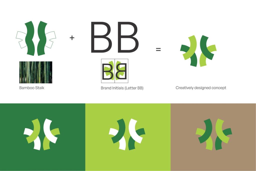
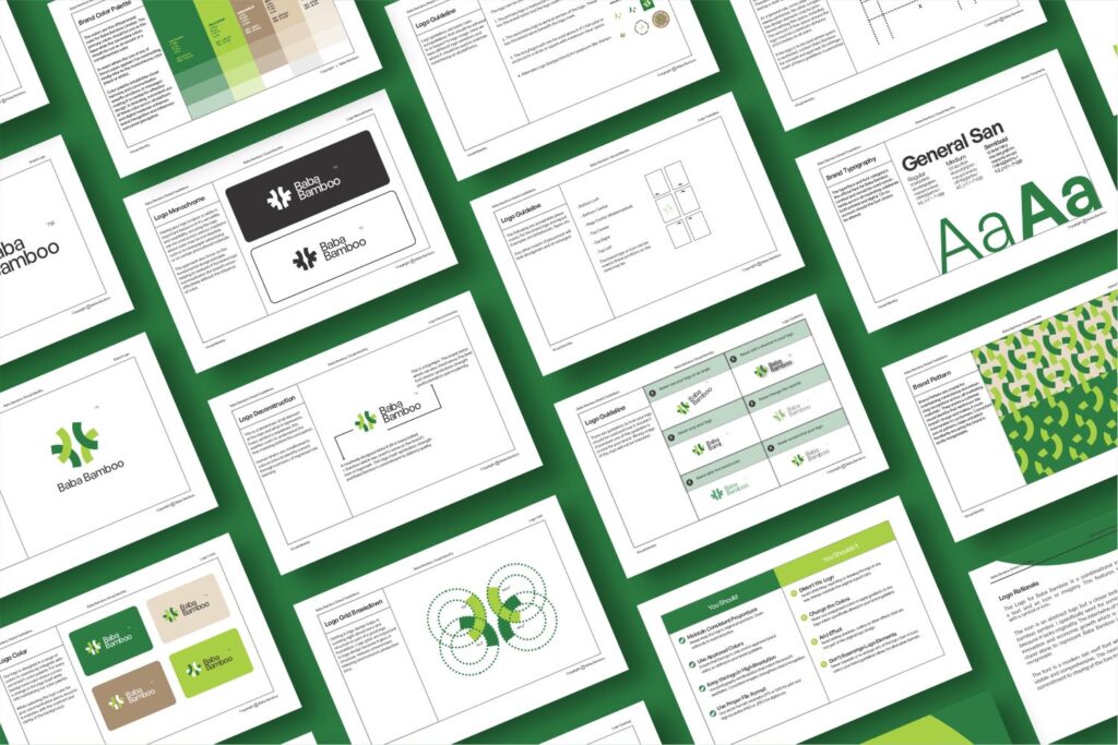
LOGO RATIONALE
The Logo for Baba Bamboo is a creative blend of elements and letters. The logo defines its visual identity, blending rich agricultural heritage with contemporary design
Key Elements:
Abstract Letter ‘BB’: The twin ‘BB’ (Brand Initials) are stylishly joined in an abstract, flowing form to create a modern and memorable icon
-Bamboo Symbol: The bamboo stalk is subtly woven into alongside the “BB,” reiforcing the company’s product and echos. The design uses symmetrical balance to avoid clutter while communicating growth, sustainability and strength- the defining characteristics of bamboo
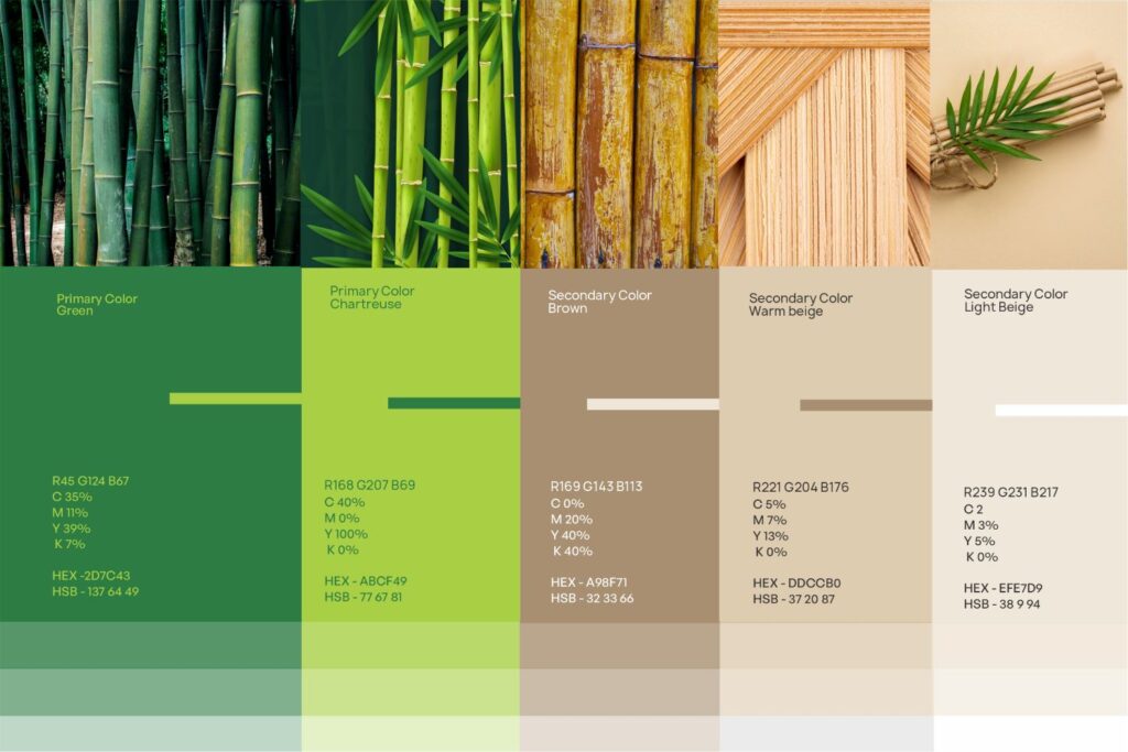
COLOR RATIONALE
The color palette for Baba bamboo has been intentionally crafted to reflect the brand’s natural origin, sustainable practices and earthy values.
GREEN: Green symbolizes growth, sustainability and enviromental consciousness. Green is also associated with nature representing the living essence of bamboo. Emotionally, green evokes freshness, balance and harmony with nature reflecting the company’s commitment to enviromental responsibility, eco-friendly innovation and circular production systems.
BROWN: Brown symbolizes the raw, organic nature of bamboo as a material. To its fibrous stalks to it rich earthy finish in processed products. Brown also conveys reliability strength, and craftsmanship, connecting to the hands-on work and expertise behind bamboo processing.
BEIGE: The warm beige softens the palette and brings in a sense of calm, minimalism, and warmth. It mimics the natural tone of dried bamboo and create a neutral backdrop that allows the green and brown to shine.
TO WRAP UP
From the strategy to the identity system, web product and activation every element and visual aligns with Baba Bamboo’ goal and business objective. Baba Bamboo tells a clear, consistent story of how nature meets technology and innovation.
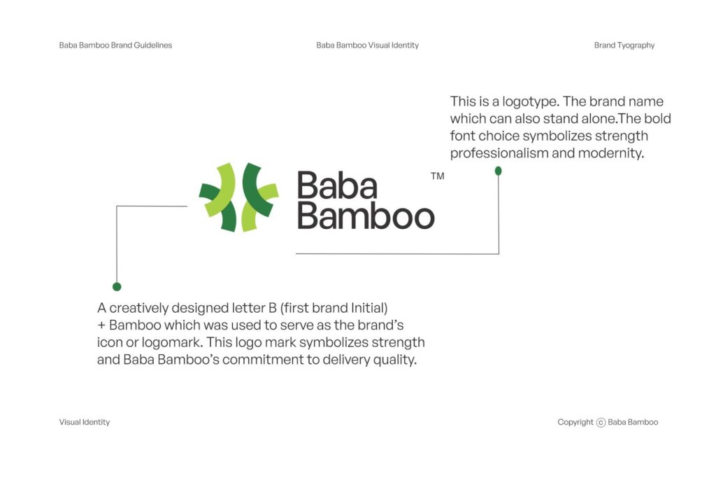
Conclusion
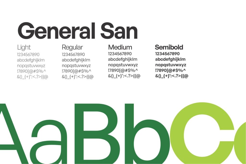
The bold structure of the ‘BB’ monogram combined with the organic bamboo element mirrors the brand’s balance of durability and versability ensuring it is conceptually rich and visually balanced. Also, the font is a modern san serif font known for its modernity and professionalism making the brand name visible and comprehensive. The overall logo design works harmoniously to express Baba Bamboo commitment to leading in innovation, eco-friendly bamboo processing and products
Let’s Get Started on Your Project
Your vision deserves more than just ideas, it deserves results. We’ll work with you step by step to bring your project to life with creativity, strategy, and precision.